Customer support rarely happens in one place. A question starts in email, the widget, your help center, or Slack. The answer may need input from product or engineering. Then the product signal gets copied into another tool, while the customer waits.
Today, we are introducing Userorbit Support: a complete support workspace built alongside your feedback and knowledge base. It brings customer conversations, team collaboration, automation, and product context into one connected workflow.
One inbox for every support channel
Bring requests from email, the Userorbit widget, your help center, Slack, or your API into one inbox. Your team can work from a single conversation and send replies back through the channel the customer used.
Forward a support address into Userorbit and keep email threads together.
Let customers start a conversation from your widget or branded help center.
Connect Slack channels and choose whether messages become a channel-wide conversation, one thread per top-level message, or a support request only when your team decides.
Share attachments across the conversation, keep Slack edits and deletions in sync, and deliver replies through the original channel.
Customers also get continuity. They can securely sign in with an email link or SSO to view current and past requests, reply, attach files, and reopen a closed request. Secure widget identification helps ensure conversations are shown to the right customer. For widget conversations, optional email reminders bring people back when they have not seen your reply.
A calmer queue with the context to act
Userorbit Support is designed for the real work between “new” and “resolved.” Organize conversations into Todo, Snoozed, and Done; assign one or more teammates; set priority, labels, account tier, and status; and use saved views to give each team the queue it needs.
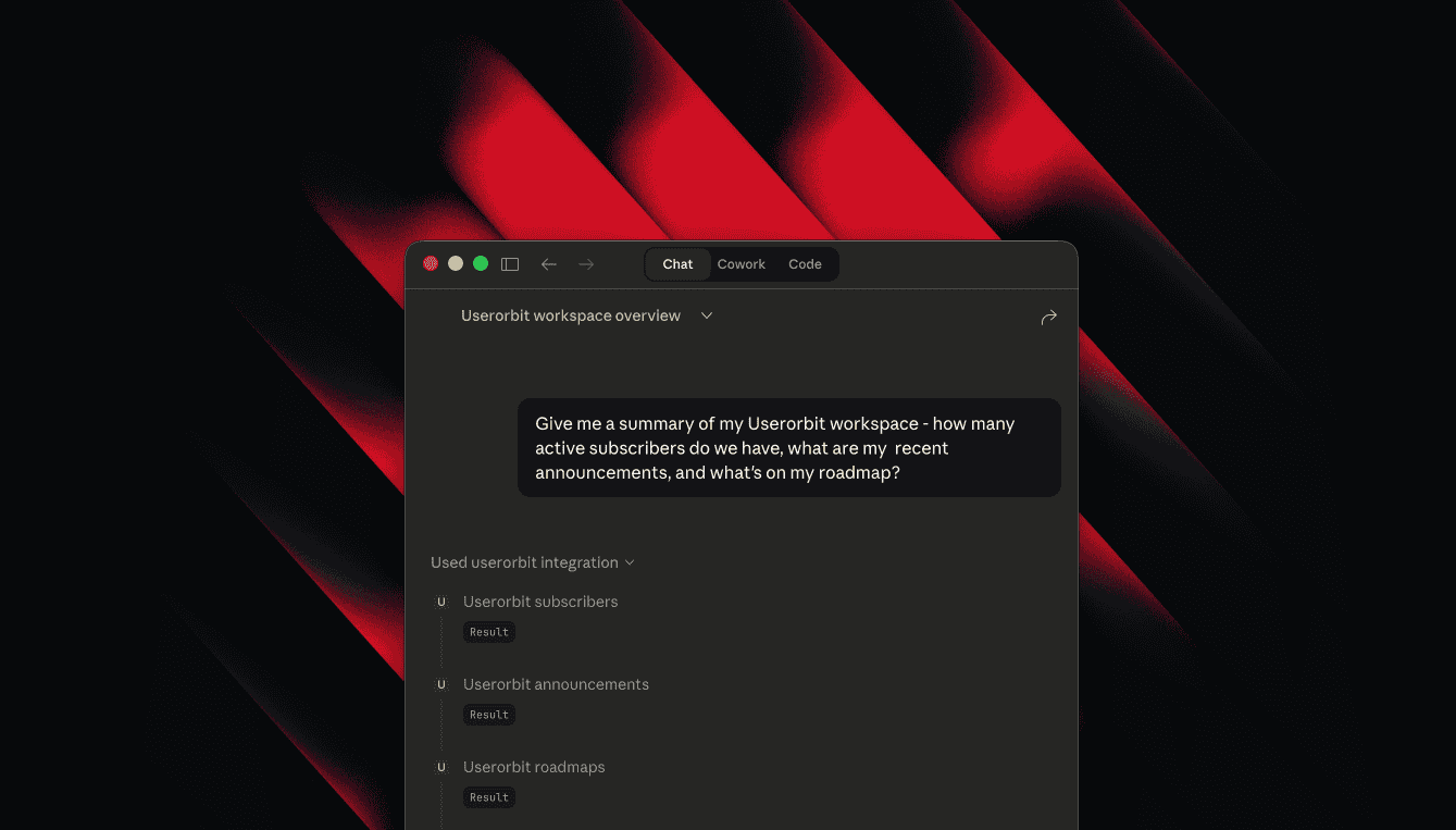
SLAs show what needs attention before a commitment is missed. Bulk actions make high-volume triage faster, while similar-thread suggestions and thread merging keep one issue from becoming several. Open any request to see the customer, company, prior conversations, recent product activity, related feedback, article reactions, and similar threads without leaving the inbox.
AI assistance and automation, with your team in control
AI assistance can draft a reply and suggest the intent, urgency, priority, status, and labels for a conversation. Your team chooses what to send and which triage suggestions to apply.
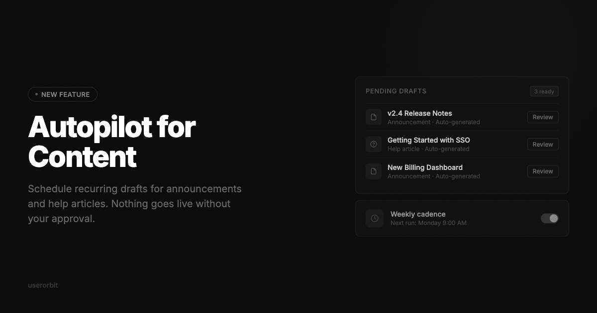
Automatic first replies can be configured by channel and can include relevant articles from your Userorbit help center. When a conversation produces a reusable answer, turn it into a help article draft directly from the thread so today’s support work improves tomorrow’s self-service.
For repeatable processes, visual Workflows automate the steps around a support conversation. Start a workflow when a thread is created, a customer or agent replies, ownership or priority changes, or on a schedule. Add conditions, wait for the right moment, then assign teammates, apply labels, change status or priority, snooze work, send a reply or internal note, notify Slack, call a webhook, and more. Run history makes every automation visible.
Support, product, and engineering in the same loop
A support conversation should not end as a closed ticket. Link it to existing feedback, create a follow-up task, connect a relevant help article, or mark and merge a duplicate. Suggested links and similar threads help surface related context faster.
When a request needs another team, start a private discussion over Slack or email from the conversation. Userorbit includes the visible thread context, keeps the discussion attached to the request, and lets your team reply, resolve, or reopen it without losing the customer story.
Work from Slack when Slack is where your team works
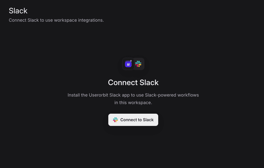
Userorbit can post new-thread alerts, personal notifications, and daily or weekly queue digests to Slack. Teammates can assign a request, update its status, or reply to the customer from the Slack notification; the reply is delivered through the customer’s original channel and saved in Userorbit.
You can also send new-feedback notifications to selected Slack channels, filter them by feedback board, and choose whether customer identity is included.
Available now
Userorbit Support is available on the Scale plan and above. Open Support to connect your first channel, invite your team into the inbox, and turn every customer conversation into faster answers and better product decisions.