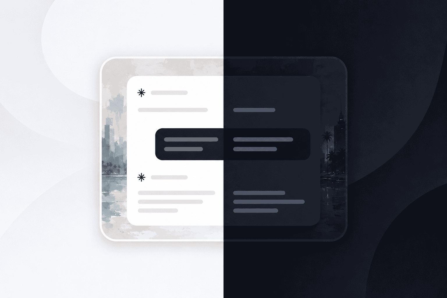
Theme support for product tours
You can now build product tour themes with dedicated light and dark variants.
Theme support makes tours feel native in applications that support dark mode, follow system preference, or need different styling for different surfaces.
What is included:
Switch between Light and Dark while editing a theme.
Preview product tours, tooltips, banners, checklists, and surveys before saving.
Customize colors, text, overlays, buttons, borders, arrows, beacons, and badges per mode.
Use
light,dark, orsystemfrom the SDK to match your application theme.Update the active theme mode at runtime with
userorbit.updateTheme().
This is available now from Tours → Themes.
Built from Feedback
Comments·0